

Color Expieriements: Week 2
Color Expieriements: Week 2
This week's color theory expieriements with my Color-Aid cards.

This week, my color studies expanded beyond my sketchbook into various mediums: collage, crochet, gouache paper cut-outs, and colored pencil. As an artist who primarily works on paper or canvas, it was invigorating to explore new mediums. I've found that my improved color sense has made me more confident when approaching these new mediums. As long as the color in my work accurately reflects the mood and atmosphere I'm aiming to express, I usually feel content with my work.
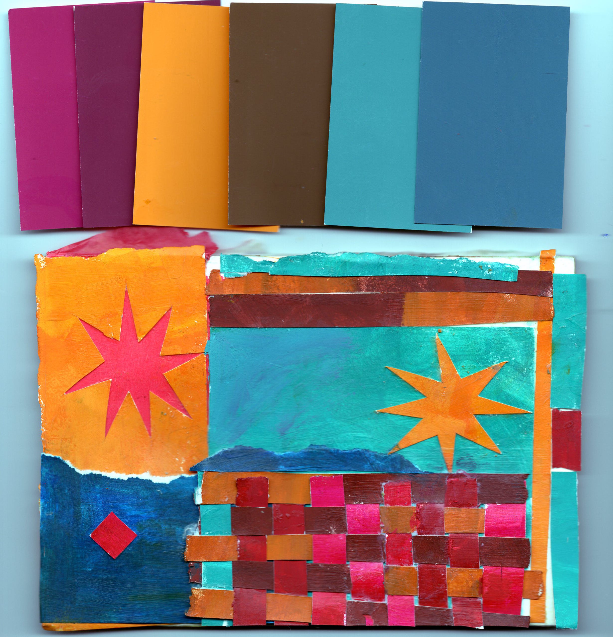
I began this week by arranging this collage from pieces of paper painted with gouache. I intuitively selected this palette of color aid cards shown above the piece and attempted to match the swatches in paint as accurately as possible. The star on the left is tissue paper, added to provide a pop of color outside of the overall color palette. I aimed to create this piece as quickly and intuitively as possible, focusing primarily on the balance of warm and cool colors and creating a sense of rhythm with modulating colors and patterns. My finishing touch was a small diamond of pyrrole red, which vibrates beautifully against its cobalt background. This piece was incredibly satisfying and fun to create!
For a long time, I've struggled to balance my desire to use highly saturated colors in my work with the need to create a sense of calm and to provide spaces within my pieces where the viewer's eye can rest. I’ve been relying on my yellow ochres and burnt siennas to create these visual resting points.
Lastly, I did the “reversed grounds” excercise from the book “Interaction of Color” by Joself Albers. I have a hard time comprehending the text in this book, and I had to ask chat GPT to interpret the text for me. Here’s a more simplified breakdown of the steps for this expieriement.
Select a background color. I chose a dark red orange.
Select two other colors to test their influence against the background. These two colors should strongly contrast eachother in hue, intensity or value so that this effect can be observed.
Cut out two larger pieces for the background color, and two smaller pieces for your forground colors and paste them together
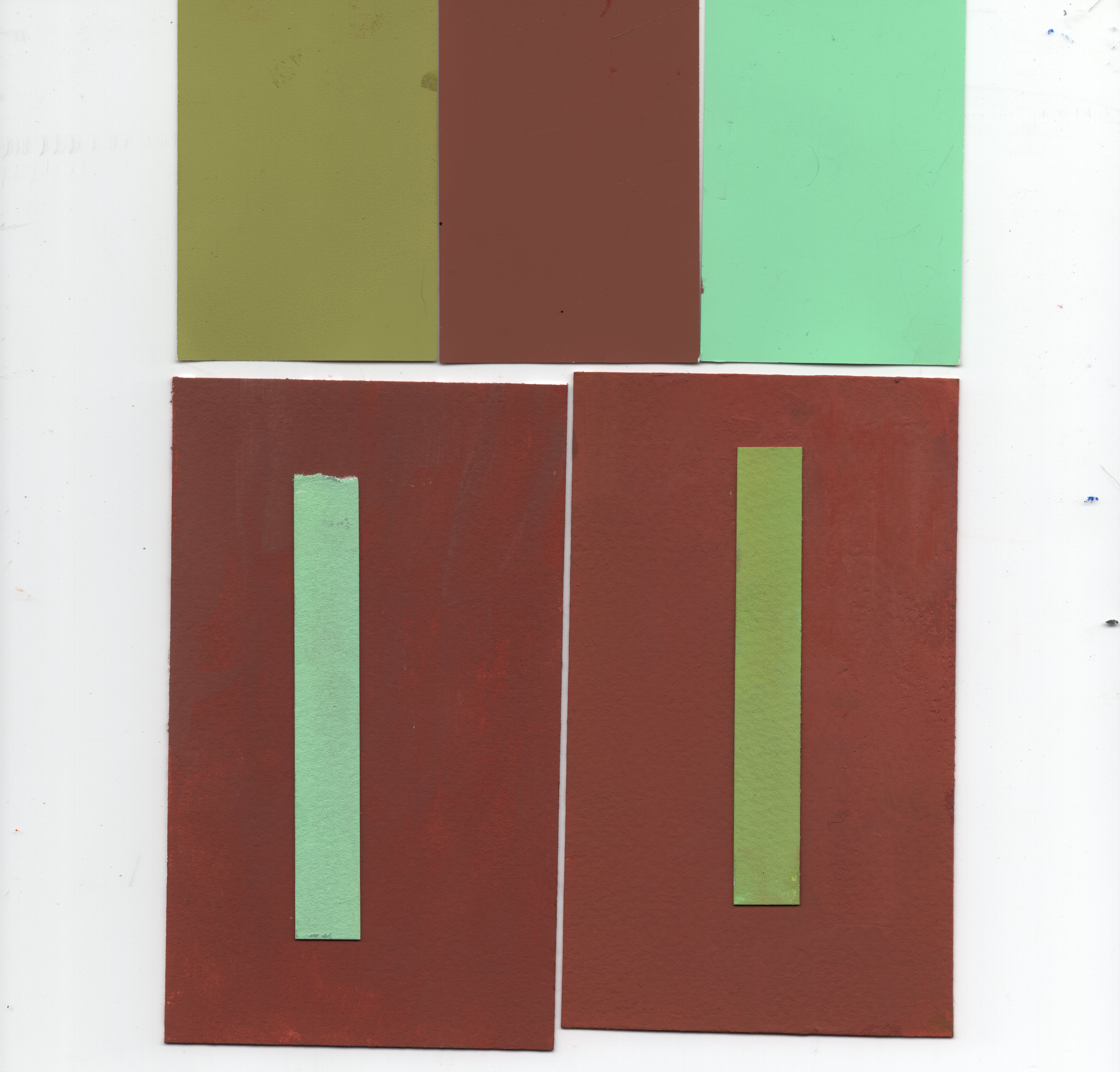
The basic idea of this excercise is to observe how a color might influence it’s background. You choose a background, and two colors to show how different colors might act against this background. Unfortunately, after I scanned this I realized my backgrounds were a little streaky, so this isn’t the most perfect execution of the excercise, but I learned a few things from it anyways.
The background I chose was a dark red orange (burnt sienna).
The green on the right leans closer to a warmer green, therefore causing it to recede into the background.
The minty green on the left has the opposite effect, and seems to jump out from the background. This is because this green leans cooler, therefore creating a strong contrast in color temperature from it’s warm background.
The Josef Albers excercises are incredibly challenging, but they’re definitely helping me to develop a stronger control over the color I use in my work.
That’s all for my color expieriements this week. Feel free to let me know what challenges you might be having with color, and perhaps we can work through it together!
I feel like I have no control over the color I use. I am like a blind baby running only emotions. Haha! It’s a fun way to work but not the only way for sure. I like how it feels or I don’t and I don’t know why. I dont think this is a good or bad way to make art but it is a way, LOL! It definitely lacks intentionality and only relies on fleeting feelings which I don’t think is always bad, but if I want to achieve something specific I have a lot of trouble because I don’t think very critically or intentionally about it. Luckily I rarely have a strict expectation of the feeling I want to convey and sort of let it unfold in front of me as I go. Then I either like it or I don’t and try again. I like reading about your process and tools! Thank you for sharing!